
Product Detail Pages on Provi
Providing retailers with a space that allows them to easily find all the data, content, and information possible about a product they are interested in ordering.

Role
Lead Product Designer
Date
Jan 2023 - Current
Team
Product Manager, Tech Lead
Context
Provi is a tool for businesses, like bars and restaurants, to streamline their alcohol ordering process by searching the marketplace for products then building and sending orders to their respective distributors to process.
It saves retailers a lot of time and is one of Provi’s biggest value adds. Unlike your typical e-commerce or two sided marketplace, the products and data associated come from a variety of data sources. Some verified, and some not.
Problem
Conversion funnel is shortening and the value of the product detail page has changed.
Before: Adding to cart used to be a multi-step process. Buyers who knew what they needed, were spending a lot of time going through the same cycle over and over again, just to add an item to their order. This was a very inefficient process.
After: Now, the search and product listing page experience has allowed buyers to see SKU level information and to add and item to their order. This changes the primary purpose of a product detail page from being the place to see SKUs and add to cart.
This new experience has brought a lot of efficiency to our users, but has left an opportunity to address the value of our product detail page. So, why would someone visit the product detail page?
Hypothesis
To add value to a product detail page, we need to design a space for the user who is in discovery mode. The buyer who’s interested in finding new products to bring into their business.
Research & Discovery
Evaluate current experience vs. customer needs through data and focused research
Current Experience Evaluation
The product detail page has historically been a hodgepodge of quick solutions and implementation, which has turned the whole experience into a large, fragile, page that directly effects our users with very slow load times and inconsistent information. From an engineering perspective, this page has become the personification of tech debt. We now have the opportunity to clean the experience up, from front end to back end, to provide users with a faster and cohesive experience.
We met with our engineers and broke down every instance and variation of today’s product detail page and pulled out themes:
12 instances of the page: Inconsistent experiences from page to page is confusing
Making decisions for the user: Trying to be “smart” is causing very slow load times
Layout doesn’t scale: Sheer amount of information is hard to read and digest in a small space
Tech debt: All of these points amounted to major tech debt within the page that needed to be addressed


This is a spreadsheet of all the product data we had and it’s coverage
Rich product data at our finger tips
With the acquisition of Sevenfifty, a direct competitor, we were able to access their rich product data provided by verified sources like distributors and suppliers.
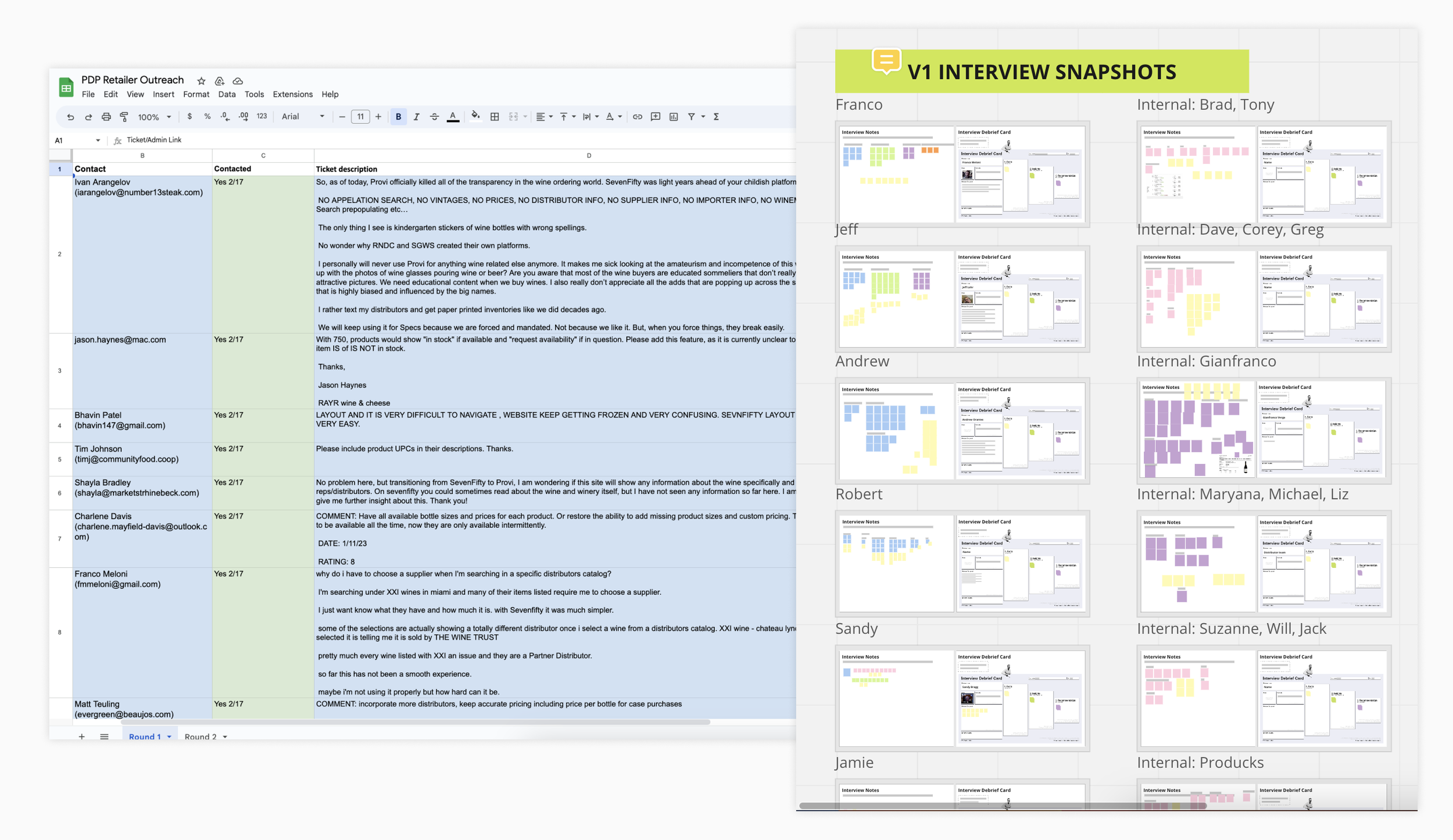
Internal & Retailer Interviews
Understand the behavior of buyers who are browsing and searching, but not ordering on Provi.
Internal feedback (Sales & Customer Support)
Hierarchy of the page is dependent on the product type
Too many clicks to get to the information you need
Do not trust the price and deal data
User feedback
Do not trust the price and deal data
Provi only works with Sales Rep buy-in
Lack of product and order history detail

Business Stakeholder Interview
Align with business stakeholders and members of leadership around the purpose and direction of the page
Turning insights into opportunities
Once we distilled our research, we were able to focus our solutions through a “How might we” exercise.

Problem Definition
Buyers that continue through to the product detail page are likely looking for more information about the product. This will help them them decide whether or not they should order it for their business. However, today the product detail page does not provide users with enough information about a product for them to confidently make that decision. Additionally, the information we do provide on the page is not displayed in digestable way and is often hidden by multiple interactions. This contributes to user frustration and lack of trust in our system.
Design Exploration & Concepts
Paint and sell future vision based on insights
Focus 1 - Layout, IA, and Hierarchy
Focus 2 - Transparent and simplified data display
Focus 3 - Additional functionality and content
Focus 1 - Layout, IA, and Hierarchy
Highlight and bring focus the robust data we have to display about a product, while providing the ability to easily access any additional information.


Test & Refine Concepts
Evaluate concepts with cross-functional team and customers
Testing Focus 1
Is the proposed layout and information hierarchy easy to digest and align with the new purpose of the page?

This was a great test! We were able to get our designs in front of 6 users and many internal folks for awesome discussion and feedback.
What was working:
Tabbed navigation is clear
New design of information is more prominent / visible
Pricing above product info is right hierarchy
Distributor order requirements were made more clear
Sales rep info helpful to buyers: name & contact info
What wasn’t working:
Difficulty understanding what prices mean
Distributor order requirements may be better associated with pricing/availability
Does not fully trust "in stock" status without knowing how much is in stock
Previously ordered info is valuable but was missed by retailers when looking at the design
Focus 2 - Transparent and simplified data display
Set better expectations and build trust with buyers around pricing, deals, and availability by bringing transparency and unity to the information we display.


Testing Focus 2
Are the proposed updates to product data easy to understand and provide transparency into the pricing and availability of the product?

Unfortunately our recruiting efforts fell short and we were only able to show these designs to two retailers.
Additional retailer testing necessary for Focus 2
Recruit participants for a moderated usability test
Recruit participants for an unmoderated usability test using Maze
The feedback from internal folks and distributor partners was fruitful, though!
Our pricing and deals transparency was well received and understood
Distributor data was clear, especially for products sold by multiple distributors
Discussion around displaying all vintages at once vs. selecting the vintage you want to see
Focus 3 - Additional functionality and content
Use content to further engrain Provi into the establishment – could the content be utilized to educate servers, bartenders on products

To be continued…
As we continue to validate the proposed experience, we are working with our engineering team as they re-architect the current experience to align with our general direction. The MVP will consist of:
Displaying all SKUs at once, with filtering options
Unify display of pricing & discounts
Introducing product data
